


While redesigning its website in late 2011, the University of California system attempted to quietly unveil a new monogram. In a jarring departure from the traditional circular seals with which its individual constituent campuses identify, the system’s administration opted to rally behind the standard of a blockish U enclosing a fading yellow C. The monogram borrows the open book insignia found on the seal and seems to vaguely reflect the University’s motto, “Let There Be Light.” To most people, however, the associations were of a rather different nature: The thing looks like a flushing toilet.
What was supposed to have been a quiet rite of rebranding instead quickly incited public outrage. Compounding the woes of the already-garish design was the juicy fact that the University had neither called upon the formidable resources of its collected visual arts departments in drafting the monogram nor sought the opinions of faculty, students, or alumni in approving and implementing the design. A year—and a petition signed by over 50,000 Californians—later, UC officials withdrew use of the monogram.
Beyond providing a cautionary tale to any institution looking to modify its public image, the details of the story have no explicit relevance to our U of C. The basic premise, however, should sound quite familiar to anyone who’s not a first-year here: UChicago officials just “updated” our logo last spring in an effort primarily to improve its appearance and visibility across digital media. And like at the other UC, I don’t think any significant effort was made to seek or incorporate student opinion into the design or implementation process. Luckily for us, our redesign works: The redistribution of color across the logo led to a design that is substantially more balanced and dynamic—and, as desired, more easily recognizable when viewed on a computer screen.
But it didn’t have to turn out that way, of course. It’s no secret that the University generally does a desultory job at canvassing student opinion (or, having done so, taking it into consideration), and I’m confident that you can probably think of a good number of projects that have gone sour as a result. Instead of bemoaning this bygone conclusion—and I’ll concede that the administration has been sharpening its act of late—how about some bona fide student opinion on UChicago’s latest adventure in rebranding?
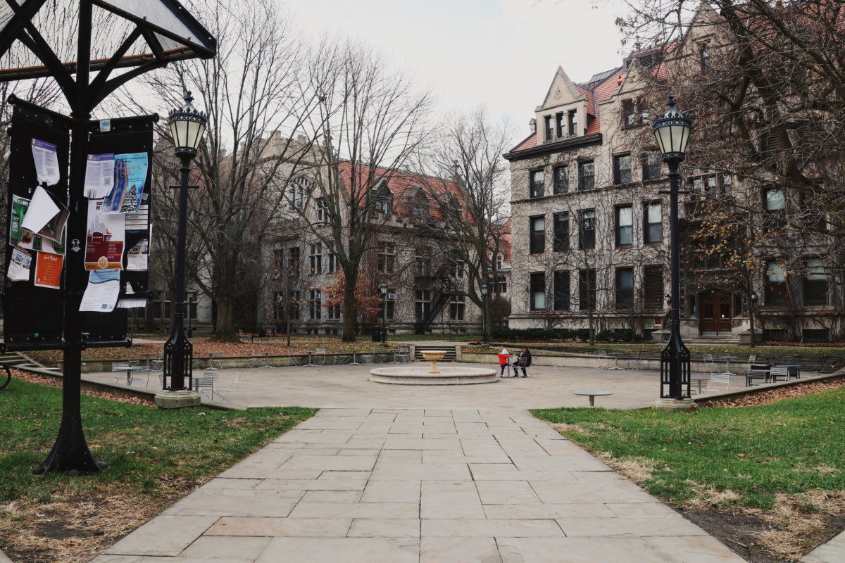
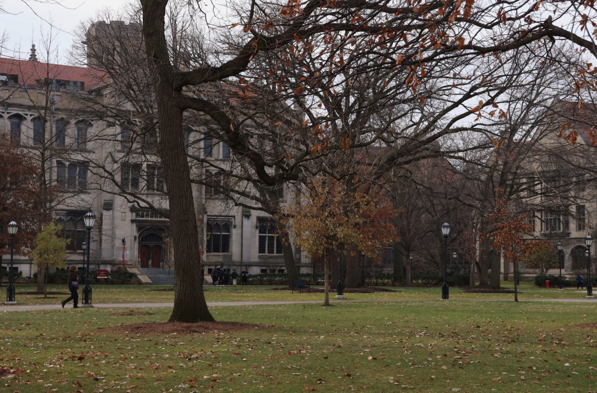
What’s with all this damned new signage on campus? You can’t have missed the campus maps that recently sprouted up in front of the Reg and at the University Ave. entrance to the quads (among other places), nor can you have missed the special University-stylized road sign near the intersection of 57th and Ellis. I’m a fan of maps, and it’s generally nice to know where you’re heading when you’re driving. But I just can’t help feeling like these things were designed by someone utterly unfamiliar with our campus spirit and culture. The anemic beige of their frames is neither reflected anywhere in our architecture nor in our grey-inflected, formally specified “signature color palette”. Sparse wording on some of the signs leaves many of them feeling empty and farcically bulky. The signs have a stoic, university feel to them—it’s just emphatically not our university that I feel in them.
Statements like that last one are hard to back up in general—when people complained that the University of California monogram didn’t square with their conceptions of the university system, administrators effectively responded with a “Well, duh, that’s the whole point of rebranding.” Perhaps our signs are, well, signs of what the future University of Chicago will look and feel like. But what a bleak future that would be.
Tyler Lutz is a fourth-year in the College majoring in physics and English.